 Modern magazine design started when Alexey Brodovitch was appointed art director of the American edition of Harper’s Bazaar in 1934. Today, many art directors working in advertising, editorial and book design remain inspired by the work of this Russian-born art director and are indebted to him.
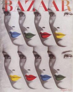
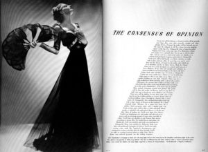 With his innovative use of typography, illustration and photography Brodovitch revolutionized and defined the look and feel of fashion magazines. He was the first to use a typeface with delicate serifs for the magazine’s masthead and many fashion magazines followed suit. Before the Dutch became renowned for their Total Football in the 1970s, Brodovitch had already introduced Total Layout, integrating image and text in his work. His layouts were ‘open’ as he left a lot of white space on the pages. The typography was experimental, refined and playful. He introduced typographic section start pages, big drop caps and initials at the beginning of a body text and the shape of the text sometimes echoed the pose of the model in a photograph.
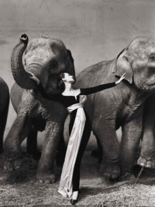
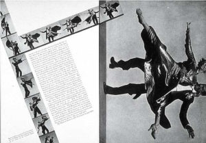 Brodovitch used photography to bring exciting dynamism and movement in his layouts. He achieved this by mixing small and large images on a spread, unconventional cropping, let images run over the page fold or position them in a 45 angle. Brodovitch worked with the best photographers, including Henri Cartier-Bresson, George Hoyningen-Huene, Man Ray and gave Richard Avedon his first assignment. He used to brief the photographers with just two words: “astonish me”.
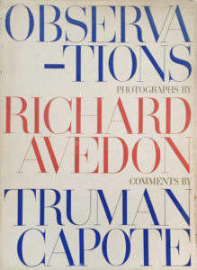 Brodovitch was frustrated that his design ideas were interrupted by advertising pages in the magazine. Perhaps his book designs are his best designs as there was no interference of advertising. He could completely focus on the rhythm of the pages. His design for Richard Avedon’s book ‘Observations’ is a landmark in photographic monographs. For a photography book, it is quite remarkable that the cover doesn’t feature an image by Avedon but only type set in blue, red, grey and the refined typeface Didot with its fragile serifs. He edited a book like a filmmaker is telling a story. Other projects by Brodovitch also feature only type on the cover such as ‘Ballet’ and ‘Portfolio’ (1949) – an art and design publication showcasing his phenomenal graphic skills.
 What we learned from Brodovitch?
Every time we look at his work we are still amazed how fresh, simple and timeless it is. It is inspiring how he integrates text and image, used white space, created the rhythm and flow of the publication, and how the photography leads the design. A divine, larger than life picture as ‘Dovima with elephants’ in which the model posed in between two elephants in a Dior gown, doesn’t need to be accompanied by bold typography but by a modest classic typography. The photography is the design. Brodovitch’s legacy remains to astonish us.
Next monograph: The Graphic Language of Neville Brody, art director of The Face and Arena.