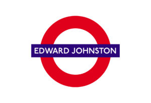
The sentence you’re reading now is set in the typeface ‘Georgia’ (Bold Italic) – a typeface that was especially designed to be readable at small sizes on a computer screen. In his book ‘Just My Type’ the author Simon Garfield has written a light-hearted, educational (but page turning), engaging book on typefaces that is filled with amusing and, in some instances, bizarre anecdotes about the people who designed these, or the purpose as to why they were designed. For instance the story behind one of the most remarkable typeface in the world Edward Johnston’s typeface for the London Underground or Paul Renner’s Futura used by Nike, FedEx and Swiss Air.
In this Q&A with ‘200%’, Garfield discusses the ‘playful’ typography used within his book, the ‘disease’ Typomania and the top 10 modern typefaces that are currently his ’type’…
200%: Was there a particular experience that triggered you to write a book about typefaces or was it purely on the basis of Duncan Clark’s original idea?
Simon Garfield: I’ve been interested in type since I pored over album covers in my excitable youth – Bowie, T Rex, The Faces. They were as important as the image of the artist, clearly saying something about what lay inside. And after that, as most writers would attest, there’s great fascination in how using a different font can change the emotion and intensity of what you’re writing. So when Duncan Clark had the idea, and my editor Mark Ellingham mentioned it to me, it took me about three seconds to realize what a good idea it was.
200%: In the chapter “What is it about the Swiss” you write about the New Yorker Cyrus Highsmith who tried to “spend a day without Helvetica”. This was quite challenging as the typeface is ubiquitously present in our lives. Whenever Highsmith saw something spelled out in Helvetica he averted his eyes. He wouldn’t take any Helvetica-signed Transport or buy any Helvetica branded products.After you had written this book, when you walk in the street, do you look at signs of shop windows and try to identify the typeface?
Simon Garfield: Sadly, yes. It’s a disease called Typomania – wherever I go, I see lettering and signs and advertising in a new way, looking behind the message, at the clothing of what’s being said. I might not enjoy a film so much if I can’t recognise the font of the opening credits. So I loved “The Social Network”: Futura – that was easy.
200%: Your background is not design journalism or critiquing, which may be the reason that your book on typefaces and fonts is very light-hearted, amusing and engaging, whereas most books on typefaces are very serious, even earnest. Do you consider it turned out to be advantageous that you don’t have such a background and could approach the subject more as an outsider?
Simon Garfield: Definitely. The world of type designs and typography, like any important and creative world, is full of little debates and spats and wars, sometimes based on elitism, most often based on heartfelt passion. So it helped that I came to it all afresh. This also enabled me to pick out what I thought would be the most interesting stories for the general reader – freed up rather than hampered by what had gone before.
200%: The typography of your book is quite playful. The text is set in a variety of typeface, including Sabon, Univers. When a typeface is mentioned it is printed in the actual typeface, i.e. when you discuss Helvetica it is printed in Helvetica. Could you tell me how the ideas of the typography of your book came about?
Simon Garfield: There was always this question from the beginning: how do we present the book in the most appealing way? One initial thought was to have a different typeface for every chapter, connected with the main face under discussion, but obviously display faces like Albertus and Cooper Black would be almost illegible at text sizes. So the designer James Alexander played around with a few options, and we settled on Sabon as the main text, Univers for the diversions about particular designers, and then we had a one-off use for all the type names we were describing. Not a cheap or easy exercise – we used more than 200 – but I think it works.
200%: You have interviewed many typeface designers and written about their work. Having heard the anecdotes, the purpose of the typeface design, and the creative process, what do you consider is the most remarkable achievement produced by a type designer?
Simon Garfield: That would be the achievement of producing anything original at all, and having the patience and inspiration to do so. How can one possibly create a new M or A that hasn’t been made in the proceeding 560 years?
200%: What do you think is one of the funniest anecdotes about a typeface you have heard?
Simon Garfield: It’s more poignant than funny, but I do love the story in the book about Doves, and the desire to drown it in the Thames so that no one else could use or abuse it. The type is still in there somewhere, if you’re feeling adventurous.
And I do like the story, not in the hardback, but certainly destined for the paperback, in which the all-round family entertainer Michael Ball introduced a listener’s email request on his Radio 2 show by saying, ‘And this one’s from Helvetica Bold – what a lovely name!’
200%: Our choice of typeface can send a signal about a person’s character. According to the Pentagram online questionnaire called “What type are you?” your type, is a typeface called Archer Hairline.Your name on the cover of your book ‘Just My Type’ is set in the typeface Gill Sans, which is said to convey Britishness, scarcity, proper, reservedly proud, no fuss and practical. What typeface do you think portrays your character: Archer Hairline, Gill Sans or one of the typefaces of your other books Bookman, Sabon, Akzidenz Grotesk, Bembo?
Simon Garfield: Ah, that would depend on my mood at the time. I think we chose Gill Sans as a sane contrast to the other mad choices on the jacket. If my head is full of music, then I’ll go for something dramatic and flowery; if I’m being sincere I’ll have Helvetica. I think the fonts on my other books have fairly well represented what lies inside. On my gravestone I’d settle for Albertus.
200%: On the inside of the book jacket you say you have a current soft spot for the typefaces Mrs Eaves and HT Gelateria. Could you give a top 10 of your favourite typefaces, and the reasons for their selection?
Simon Garfield: Oh well, here goes. I need to tell you that these are my current modern fonts (i.e. it’s pointless putting them up against Baskerville etc) and that the list tends to change every hour or so:
1. Vitesse
This is a modern slab serif, with prominent feet grounding it to the page. It’s quite a traditional look, but the design company Hoefler & Frere-Jones have given it some nice quirks, not least on the upper-case K and G. I especially like the wafer thin version.
2. Progress Two
This reminds me of shapes one might make from pastry cutters. Just as you think you know what’s coming, an irregular cut-off stops you short. The upper-case B is a D with an elbow in its stomach. Slightly queasy, never boring.
3. HT Gelateria
The name says it all, a typeface that sells you ice cream. A thick, gooey script font – I wish I had handwriting like that.
4. Candy Script
Just outrageously beautiful and painterly. The o and w are my favourites. Put this on a bag of homemade cookies and you’ve got a sale.
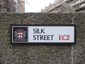
5. Albertus
The oldest type in this list, and always a reliable standby. Designed by Berthold Wolpe in the 1930s, it features on Faber book jackets and street names in the City of London. I love it for its human carved qualities, and because it decorates the signs on Hampstead Heath, my local walking spot.
6. Jimbo
Made by the great Jim Parkinson, who also designed the current Rolling Stone magazine logo/masthead. It’s a modern fat face poking fun and bursting with energy.
7. Lavigne Display
Ultra-fashionable and decadent, this serif is inspired by calligraphy and the flapper age, a high-contrast style with surprising thick and thin strokes. The brilliantine lick of the ear of the g is straight from Gosford Park.
8. Ogaki
Almost easier to draw than describe, this is a heavy display face with traces of Matisse. Distinguished by its fine dissecting lines, it’s one of the boldest new faces of the century.
9. Blur
Neville Brody’s vision of type in the beerlight, or type viewed through glass. Or perhaps it’s a typewriter ribbon that should have been changed a fortnight ago. A modern classic.
10. Dionisio
Only one way to describe this, and it’s the font fan’s favourite word: elegant. Not quite Bodoni, but an indulgent contemporary equivalent. The a looks noble, the F like a train shunt. The only choice for today’s discerning wedding invitations.
Interview written and conducted by Thierry Somers
Just My Type by Simon Garfield, Profile Books
Just my type of article? The second issue of 200% features an interview with the designers of Gotham, Retina and Hoefler Text, Tobias Frere-Jones and Jonathan Hoefler, “Everything you always wanted to know about typefaces, but were afraid to ask”. www.200-percent.com
 The sentence you’re reading now is set in the typeface ‘Georgia’ (Bold Italic) – a typeface that was especially designed to be readable at small sizes on a computer screen. In his book ‘Just My Type’ the author Simon Garfield has written a light-hearted, educational (but page turning), engaging book on typefaces that is filled with amusing and, in some instances, bizarre anecdotes about the people who designed these, or the purpose as to why they were designed. For instance the story behind one of the most remarkable typeface in the world Edward Johnston’s typeface for the London Underground or Paul Renner’s Futura used by Nike, FedEx and Swiss Air.
In this Q&A with ‘200%’, Garfield discusses the ‘playful’ typography used within his book, the ‘disease’ Typomania and the top 10 modern typefaces that are currently his ’type’…
200%: Was there a particular experience that triggered you to write a book about typefaces or was it purely on the basis of Duncan Clark’s original idea?
Simon Garfield: I’ve been interested in type since I pored over album covers in my excitable youth – Bowie, T Rex, The Faces. They were as important as the image of the artist, clearly saying something about what lay inside. And after that, as most writers would attest, there’s great fascination in how using a different font can change the emotion and intensity of what you’re writing. So when Duncan Clark had the idea, and my editor Mark Ellingham mentioned it to me, it took me about three seconds to realize what a good idea it was.
The sentence you’re reading now is set in the typeface ‘Georgia’ (Bold Italic) – a typeface that was especially designed to be readable at small sizes on a computer screen. In his book ‘Just My Type’ the author Simon Garfield has written a light-hearted, educational (but page turning), engaging book on typefaces that is filled with amusing and, in some instances, bizarre anecdotes about the people who designed these, or the purpose as to why they were designed. For instance the story behind one of the most remarkable typeface in the world Edward Johnston’s typeface for the London Underground or Paul Renner’s Futura used by Nike, FedEx and Swiss Air.
In this Q&A with ‘200%’, Garfield discusses the ‘playful’ typography used within his book, the ‘disease’ Typomania and the top 10 modern typefaces that are currently his ’type’…
200%: Was there a particular experience that triggered you to write a book about typefaces or was it purely on the basis of Duncan Clark’s original idea?
Simon Garfield: I’ve been interested in type since I pored over album covers in my excitable youth – Bowie, T Rex, The Faces. They were as important as the image of the artist, clearly saying something about what lay inside. And after that, as most writers would attest, there’s great fascination in how using a different font can change the emotion and intensity of what you’re writing. So when Duncan Clark had the idea, and my editor Mark Ellingham mentioned it to me, it took me about three seconds to realize what a good idea it was.
 200%: In the chapter “What is it about the Swiss” you write about the New Yorker Cyrus Highsmith who tried to “spend a day without Helvetica”. This was quite challenging as the typeface is ubiquitously present in our lives. Whenever Highsmith saw something spelled out in Helvetica he averted his eyes. He wouldn’t take any Helvetica-signed Transport or buy any Helvetica branded products.
After you had written this book, when you walk in the street, do you look at signs of shop windows and try to identify the typeface?
Simon Garfield: Sadly, yes. It’s a disease called Typomania – wherever I go, I see lettering and signs and advertising in a new way, looking behind the message, at the clothing of what’s being said. I might not enjoy a film so much if I can’t recognise the font of the opening credits. So I loved “The Social Network”: Futura – that was easy.
200%: Your background is not design journalism or critiquing, which may be the reason that your book on typefaces and fonts is very light-hearted, amusing and engaging, whereas most books on typefaces are very serious, even earnest. Do you consider it turned out to be advantageous that you don’t have such a background and could approach the subject more as an outsider?
Simon Garfield: Definitely. The world of type designs and typography, like any important and creative world, is full of little debates and spats and wars, sometimes based on elitism, most often based on heartfelt passion. So it helped that I came to it all afresh. This also enabled me to pick out what I thought would be the most interesting stories for the general reader – freed up rather than hampered by what had gone before.
200%: The typography of your book is quite playful. The text is set in a variety of typeface, including Sabon, Univers. When a typeface is mentioned it is printed in the actual typeface, i.e. when you discuss Helvetica it is printed in Helvetica. Could you tell me how the ideas of the typography of your book came about?
Simon Garfield: There was always this question from the beginning: how do we present the book in the most appealing way? One initial thought was to have a different typeface for every chapter, connected with the main face under discussion, but obviously display faces like Albertus and Cooper Black would be almost illegible at text sizes. So the designer James Alexander played around with a few options, and we settled on Sabon as the main text, Univers for the diversions about particular designers, and then we had a one-off use for all the type names we were describing. Not a cheap or easy exercise – we used more than 200 – but I think it works.
200%: You have interviewed many typeface designers and written about their work. Having heard the anecdotes, the purpose of the typeface design, and the creative process, what do you consider is the most remarkable achievement produced by a type designer?
Simon Garfield: That would be the achievement of producing anything original at all, and having the patience and inspiration to do so. How can one possibly create a new M or A that hasn’t been made in the proceeding 560 years?
200%: What do you think is one of the funniest anecdotes about a typeface you have heard?
Simon Garfield: It’s more poignant than funny, but I do love the story in the book about Doves, and the desire to drown it in the Thames so that no one else could use or abuse it. The type is still in there somewhere, if you’re feeling adventurous.
And I do like the story, not in the hardback, but certainly destined for the paperback, in which the all-round family entertainer Michael Ball introduced a listener’s email request on his Radio 2 show by saying, ‘And this one’s from Helvetica Bold – what a lovely name!’
200%: In the chapter “What is it about the Swiss” you write about the New Yorker Cyrus Highsmith who tried to “spend a day without Helvetica”. This was quite challenging as the typeface is ubiquitously present in our lives. Whenever Highsmith saw something spelled out in Helvetica he averted his eyes. He wouldn’t take any Helvetica-signed Transport or buy any Helvetica branded products.
After you had written this book, when you walk in the street, do you look at signs of shop windows and try to identify the typeface?
Simon Garfield: Sadly, yes. It’s a disease called Typomania – wherever I go, I see lettering and signs and advertising in a new way, looking behind the message, at the clothing of what’s being said. I might not enjoy a film so much if I can’t recognise the font of the opening credits. So I loved “The Social Network”: Futura – that was easy.
200%: Your background is not design journalism or critiquing, which may be the reason that your book on typefaces and fonts is very light-hearted, amusing and engaging, whereas most books on typefaces are very serious, even earnest. Do you consider it turned out to be advantageous that you don’t have such a background and could approach the subject more as an outsider?
Simon Garfield: Definitely. The world of type designs and typography, like any important and creative world, is full of little debates and spats and wars, sometimes based on elitism, most often based on heartfelt passion. So it helped that I came to it all afresh. This also enabled me to pick out what I thought would be the most interesting stories for the general reader – freed up rather than hampered by what had gone before.
200%: The typography of your book is quite playful. The text is set in a variety of typeface, including Sabon, Univers. When a typeface is mentioned it is printed in the actual typeface, i.e. when you discuss Helvetica it is printed in Helvetica. Could you tell me how the ideas of the typography of your book came about?
Simon Garfield: There was always this question from the beginning: how do we present the book in the most appealing way? One initial thought was to have a different typeface for every chapter, connected with the main face under discussion, but obviously display faces like Albertus and Cooper Black would be almost illegible at text sizes. So the designer James Alexander played around with a few options, and we settled on Sabon as the main text, Univers for the diversions about particular designers, and then we had a one-off use for all the type names we were describing. Not a cheap or easy exercise – we used more than 200 – but I think it works.
200%: You have interviewed many typeface designers and written about their work. Having heard the anecdotes, the purpose of the typeface design, and the creative process, what do you consider is the most remarkable achievement produced by a type designer?
Simon Garfield: That would be the achievement of producing anything original at all, and having the patience and inspiration to do so. How can one possibly create a new M or A that hasn’t been made in the proceeding 560 years?
200%: What do you think is one of the funniest anecdotes about a typeface you have heard?
Simon Garfield: It’s more poignant than funny, but I do love the story in the book about Doves, and the desire to drown it in the Thames so that no one else could use or abuse it. The type is still in there somewhere, if you’re feeling adventurous.
And I do like the story, not in the hardback, but certainly destined for the paperback, in which the all-round family entertainer Michael Ball introduced a listener’s email request on his Radio 2 show by saying, ‘And this one’s from Helvetica Bold – what a lovely name!’
 200%: Our choice of typeface can send a signal about a person’s character. According to the Pentagram online questionnaire called “What type are you?” your type, is a typeface called Archer Hairline.
Your name on the cover of your book ‘Just My Type’ is set in the typeface Gill Sans, which is said to convey Britishness, scarcity, proper, reservedly proud, no fuss and practical. What typeface do you think portrays your character: Archer Hairline, Gill Sans or one of the typefaces of your other books Bookman, Sabon, Akzidenz Grotesk, Bembo?
Simon Garfield: Ah, that would depend on my mood at the time. I think we chose Gill Sans as a sane contrast to the other mad choices on the jacket. If my head is full of music, then I’ll go for something dramatic and flowery; if I’m being sincere I’ll have Helvetica. I think the fonts on my other books have fairly well represented what lies inside. On my gravestone I’d settle for Albertus.
200%: On the inside of the book jacket you say you have a current soft spot for the typefaces Mrs Eaves and HT Gelateria. Could you give a top 10 of your favourite typefaces, and the reasons for their selection?
Simon Garfield: Oh well, here goes. I need to tell you that these are my current modern fonts (i.e. it’s pointless putting them up against Baskerville etc) and that the list tends to change every hour or so:
200%: Our choice of typeface can send a signal about a person’s character. According to the Pentagram online questionnaire called “What type are you?” your type, is a typeface called Archer Hairline.
Your name on the cover of your book ‘Just My Type’ is set in the typeface Gill Sans, which is said to convey Britishness, scarcity, proper, reservedly proud, no fuss and practical. What typeface do you think portrays your character: Archer Hairline, Gill Sans or one of the typefaces of your other books Bookman, Sabon, Akzidenz Grotesk, Bembo?
Simon Garfield: Ah, that would depend on my mood at the time. I think we chose Gill Sans as a sane contrast to the other mad choices on the jacket. If my head is full of music, then I’ll go for something dramatic and flowery; if I’m being sincere I’ll have Helvetica. I think the fonts on my other books have fairly well represented what lies inside. On my gravestone I’d settle for Albertus.
200%: On the inside of the book jacket you say you have a current soft spot for the typefaces Mrs Eaves and HT Gelateria. Could you give a top 10 of your favourite typefaces, and the reasons for their selection?
Simon Garfield: Oh well, here goes. I need to tell you that these are my current modern fonts (i.e. it’s pointless putting them up against Baskerville etc) and that the list tends to change every hour or so:
 1. Vitesse
This is a modern slab serif, with prominent feet grounding it to the page. It’s quite a traditional look, but the design company Hoefler & Frere-Jones have given it some nice quirks, not least on the upper-case K and G. I especially like the wafer thin version.
2. Progress Two
This reminds me of shapes one might make from pastry cutters. Just as you think you know what’s coming, an irregular cut-off stops you short. The upper-case B is a D with an elbow in its stomach. Slightly queasy, never boring.
3. HT Gelateria
The name says it all, a typeface that sells you ice cream. A thick, gooey script font – I wish I had handwriting like that.
4. Candy Script
Just outrageously beautiful and painterly. The o and w are my favourites. Put this on a bag of homemade cookies and you’ve got a sale.
1. Vitesse
This is a modern slab serif, with prominent feet grounding it to the page. It’s quite a traditional look, but the design company Hoefler & Frere-Jones have given it some nice quirks, not least on the upper-case K and G. I especially like the wafer thin version.
2. Progress Two
This reminds me of shapes one might make from pastry cutters. Just as you think you know what’s coming, an irregular cut-off stops you short. The upper-case B is a D with an elbow in its stomach. Slightly queasy, never boring.
3. HT Gelateria
The name says it all, a typeface that sells you ice cream. A thick, gooey script font – I wish I had handwriting like that.
4. Candy Script
Just outrageously beautiful and painterly. The o and w are my favourites. Put this on a bag of homemade cookies and you’ve got a sale.
 5. Albertus
The oldest type in this list, and always a reliable standby. Designed by Berthold Wolpe in the 1930s, it features on Faber book jackets and street names in the City of London. I love it for its human carved qualities, and because it decorates the signs on Hampstead Heath, my local walking spot.
6. Jimbo
Made by the great Jim Parkinson, who also designed the current Rolling Stone magazine logo/masthead. It’s a modern fat face poking fun and bursting with energy.
7. Lavigne Display
Ultra-fashionable and decadent, this serif is inspired by calligraphy and the flapper age, a high-contrast style with surprising thick and thin strokes. The brilliantine lick of the ear of the g is straight from Gosford Park.
8. Ogaki
Almost easier to draw than describe, this is a heavy display face with traces of Matisse. Distinguished by its fine dissecting lines, it’s one of the boldest new faces of the century.
5. Albertus
The oldest type in this list, and always a reliable standby. Designed by Berthold Wolpe in the 1930s, it features on Faber book jackets and street names in the City of London. I love it for its human carved qualities, and because it decorates the signs on Hampstead Heath, my local walking spot.
6. Jimbo
Made by the great Jim Parkinson, who also designed the current Rolling Stone magazine logo/masthead. It’s a modern fat face poking fun and bursting with energy.
7. Lavigne Display
Ultra-fashionable and decadent, this serif is inspired by calligraphy and the flapper age, a high-contrast style with surprising thick and thin strokes. The brilliantine lick of the ear of the g is straight from Gosford Park.
8. Ogaki
Almost easier to draw than describe, this is a heavy display face with traces of Matisse. Distinguished by its fine dissecting lines, it’s one of the boldest new faces of the century.
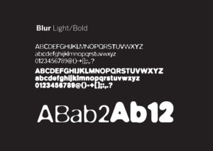 9. Blur
Neville Brody’s vision of type in the beerlight, or type viewed through glass. Or perhaps it’s a typewriter ribbon that should have been changed a fortnight ago. A modern classic.
10. Dionisio
Only one way to describe this, and it’s the font fan’s favourite word: elegant. Not quite Bodoni, but an indulgent contemporary equivalent. The a looks noble, the F like a train shunt. The only choice for today’s discerning wedding invitations.
Interview written and conducted by Thierry Somers
Just My Type by Simon Garfield, Profile Books
9. Blur
Neville Brody’s vision of type in the beerlight, or type viewed through glass. Or perhaps it’s a typewriter ribbon that should have been changed a fortnight ago. A modern classic.
10. Dionisio
Only one way to describe this, and it’s the font fan’s favourite word: elegant. Not quite Bodoni, but an indulgent contemporary equivalent. The a looks noble, the F like a train shunt. The only choice for today’s discerning wedding invitations.
Interview written and conducted by Thierry Somers
Just My Type by Simon Garfield, Profile Books
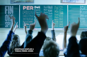 Just my type of article? The second issue of 200% features an interview with the designers of Gotham, Retina and Hoefler Text, Tobias Frere-Jones and Jonathan Hoefler, “Everything you always wanted to know about typefaces, but were afraid to ask”. www.200-percent.com