The current vinyl boom triggers an exciting resurgence of large format music packaging. A selection of 10 exciting sleeves that embody the renaissance in cover design.
1
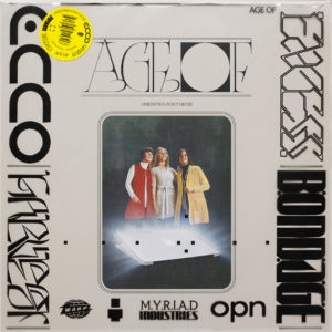
Album: Age Of
Artist: Oneohtrix Point Never
Designers: David Rudnick and Daniel Lopatin
Putting Jim Shaw’s work ‘The Great Whatsit’ featuring three women looking in awe to the sky lit by an Apple laptop screen in the foreground should already be enough to make an arresting cover. However the designers went a step further. They printed the words ecco, harvest, excess and bondage on the protective outer record sleeve in experimental, abstract geometric type designed by Rudnick. This combination with Shaw’s painting makes it a fascinating Retrofuturism cover.
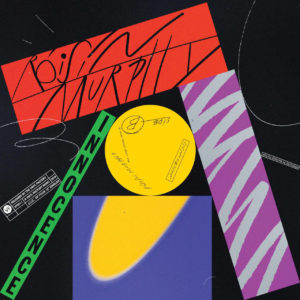
As each song on this album has a different feel the Portuguese designer make a cover for each song. The covers are bold, experimental and vibrant with airbrush illustrations and hand-drawn type. The typography and graphics are very 1980s like the Duran Duran album ‘Big Thing’ or Janet Jackson’s ‘Control’ album created by the fashion photographer and illustrator Tony Viramontes (who also did the artwork for the Arcadia album ‘So Red the Rose’). There is also a playful comic book and graffiti style type combined with rough, smudged type created by a Xerox machine. It is coherent mishmash.
3
Album: 4:44 Artist: Jay-Z Designer: Brian Roettinger
Jay-Z explained that the cryptic title of his thirteenth album refers to 4:44 am, the time he woke up to write the song.
For the artwork of this album Roettinger was inspired by corporate branding. The salmon/peach colour played an instrumental role in the promotional campaign of the album. In ‘Album Art’ Roettinger explains that they wanted to own the colour starting with the cover. “Once people are familiar with it – “Oh yeah, that’s the Jay-Z thing” – we can make merchandise that’s just the colour of the shirt and we don’t even have to say the name or title … there were billboards that had no information in the beginning – just the colour.” They hired three billboards in a row and one colour would only mention the title, another just the colour. The campaign works like the trademarked colours of brands like the red and white of Coca Cola, T-Mobile’s magenta or Post-It’s canary yellow.
4
Album: Aleph
Artist: Gesaffelstein
Designers: Fleur et Manu
Not recent (from 2013) but still very beautiful. At first it looks like a Louise Nevelson sculpture, but this foiled outersleeve resembles a circuit board with Aleph the first letter of the Hebrew alphabet in black in the middle of the cover. The CD is a contrast version: an empty CD jewel case with the circuit board printed in white with a gold disc inside.
5
Album: Suspiria
Artist: Thom Yorke
Designer: Dan Perri
The hands and the angular typeface echo the artwork of the famous film poster ‘The Man With The Golden Arm’ designed by Saul Bass. The Suspiria logo was designed by Dan Perri who also designed the title sequences of ‘Star Wars’ and ‘Raging Bull’. The artwork of this soundtrack magnificently captures the essence of this film: the hand gestures of a ballerina are very elegant, but the eyes in the hand palms and the poisonous colour combination of cyan and magenta hint to the horror in the film.6
Artist: Ladytron
Designers: Reuben Wu, Jeff Frost, Neil Krug
Reuben Wu is not only the co-founder of the band but also a visual artist and music producer. He created this arresting image in collaboration with Neil Krug (who photographed the foreground and background elements) and Jeff Frost a wildfire photographer and the director of ‘California on Fire’ a powerful film about the devastating wildfires in The Golden State. There is an element of romance and lunacy in the image of a young couple running into a fire which can be interpreted as a modern take on Romeo & Juliet or Kit and Holly in the film ‘Badlands’. These days with Photoshop any image can be created but this one is very convincing in how real it looks.
7
Album: Blackstar
Artist: David Bowie
Designer: Jonathan Barnbrook
In the book ‘Album Art’ by John Foster, the designer Stefan Sagmeister commented that “contemporary album covers right now are higher in quality (and significantly cheaper) than much exhibited in the galleries of New York”. This a fantastic example that an album can be a desirable, exhilarating, tangible object. Wonderful are the dye-cut star, the black on black printing and the abstract typography of Bowie’s name spelled in stars. As a bonus there is some magic about the vinyl edition of the album. When you remove the record and hold the gatefold sleeve up to the sunlight, the blackstar will be transformed into an entire galaxy. Just like Peter Saville and Brett Wickens’s design for the ‘Blue Monday’ single, I won’t be surprised if this album will be included by a curator in an exhibition in the future.
8
Album: Currents
Artist: Tame Impala
Designer: Robert Beatty
The sleeves of this American designer have a similar absurd, witty and sometimes psychedelic feeling as the ones designed by Hypgnosis. Inspired by the title of the album, Beatty created an intriguing drawing that looks like a pendulum ball of a Newton Cradle rolling in a puddle of oil.
9
Album: Cocoa Sugar
Artist: Young Fathers
Design: Hingston Studio
This arresting image was inspired by Richard Linder’s work. This German born artist moved to New York in the 1940s and twenty years later he started to make hard-edge figurative paintings of gangsters, harlequins, pimps, amazons – some of them erotically charged. The gender fluid people in his paintings is perfectly captured in the album cover photographed by Julia Noni. I love the shape of the lips, the black cowboy hat and there is something unsettling about the bright colours. The image could be contemporary London Soho version of the HBO series ‘The Deuce’ about the advent of the porn industry in New York in the 1970s.
10
Album: Pure Comedy
Artist: Father John Misty
Designers: Edward Steed, Joshua Tillman and Sacha Barr
It’s worthwhile to explore the intricate details of this album while listening to the music. The fascinating, bizarre doodled black and white illustrations are drawn by Edward Steed. Tillman, the former drummer of Fleet Foxes, approached the ‘New Yorker’ cartoonist to draw a medieval nightmare that expresses the theme of his album: the absurdity of human life on earth. The arrangement of the small satirical scenes on a landscape recalls ‘The Garden of Delights’ by Hieronymus Bosch. The drawing is filled with bizarre scenes such as man hitting a golf ball with a severed leg or a flasher showing a collection of watches inside his trench coat. Perhaps not ‘Pure Comedy’ but definitely black comedy.
Missing a recent record sleeve that you think is a Must See as well? Let us know:Mail@200-percent.com
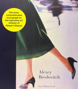
Modern magazine design started when Alexey Brodovitch was appointed art director of the American edition of Harper’s Bazaar in 1934. Today, many art directors working in advertising, editorial and book design remain inspired by the work of this Russian-born art director and are indebted to him.
With his innovative use of typography, illustration and photography Brodovitch revolutionized and defined the look and feel of fashion magazines. He was the first to use a typeface with delicate serifs for the magazine’s masthead and many fashion magazines followed suit. Before the Dutch became renowned for their Total Football in the 1970s, Brodovitch had already introduced Total Layout, integrating image and text in his work. His layouts were ‘open’ as he left a lot of white space on the pages. The typography was experimental, refined and playful. He introduced typographic section start pages, big drop caps and initials at the beginning of a body text and the shape of the text sometimes echoed the pose of the model in a photograph.
Brodovitch used photography to bring exciting dynamism and movement in his layouts. He achieved this by mixing small and large images on a spread, unconventional cropping, let images run over the page fold or position them in a 45 angle. Brodovitch worked with the best photographers, including Henri Cartier-Bresson, George Hoyningen-Huene, Man Ray and gave Richard Avedon his first assignment. He used to brief the photographers with just two words: “astonish me”.
Brodovitch was frustrated that his design ideas were interrupted by advertising pages in the magazine. Perhaps his book designs are his best designs as there was no interference of advertising. He could completely focus on the rhythm of the pages. His design for Richard Avedon’s book ‘Observations’ is a landmark in photographic monographs. For a photography book, it is quite remarkable that the cover doesn’t feature an image by Avedon but only type set in blue, red, grey and the refined typeface Didot with its fragile serifs. He edited a book like a filmmaker is telling a story. Other projects by Brodovitch also feature only type on the cover such as ‘Ballet’ and ‘Portfolio’ (1949) – an art and design publication showcasing his phenomenal graphic skills.
What we learned from Brodovitch? Every time we look at his work we are still amazed how fresh, simple and timeless it is. It is inspiring how he integrates text and image, used white space, created the rhythm and flow of the publication, and how the photography leads the design. A divine, larger than life picture as ‘Dovima with elephants’ in which the model posed in between two elephants in a Dior gown, doesn’t need to be accompanied by bold typography but by a modest classic typography. The photography is the design. Brodovitch’s legacy remains to astonish us.
Next monograph: The Graphic Language of Neville Brody, art director of The Face and Arena.
How can working with music stimulate your creative output and productivity?
This is how The Beatles, 10cc, Genesis, Bob Dylan, David Bowie and other bands stimulate ours:
The Beatles The songs of the Fab Four are an inexhaustible well of inspiration. Their early songs (I Want To Hold Your Hand, Yesterday) are direct, catchy and have a sheer simplicity. Their later songs (I Am The Walrus, A Day In The Life) are progressive, boldly experimental and incredibly versatile. In our designs and texts we aspire for clarity, fluidity and making it feel effortless.
Sparks, 10cc and Roxy Music
When you’re a French director, you’re an auteur as well/
What does that mean?/
Every scene must be obscure as hell.
Life is a minestrone/
Served up with parmesan cheese/
Death is a cold Lasagne/
Suspended in deep freeze.
These lyrics by Sparks and 10cc put a big smile on our face. The use of clever humour, puns and creative metaphors in their lyrics inspire us to be witty, tongue-in-cheek, quirky and whimsical in our creative output.
Talk Talk, Roger Waters, Nils Frahm and record producer Trevor Horn The production of these musicians’ albums is unprecedented. All the phases in the production process of an album such as recording, engineering, mixing, arranging and mastering are meticulous. Nils Frahm went to great lengths in recording his album ‘All Melody’ at one of the most illustrious sounding recording studios, Funkhaus in former East-Berlin. “After we did new cabling, electricity, woodwork, and new acoustic treatment in the control rooms, we started building a custom mixing console”, Frahm writes on the dust jacket of the album. The mixing console is called Konsil 1 and it took Matthias Hahn and his team two years to build it.
The search for perfection of these production geeks inspire us to deeply care about the production of our magazines and books such as the execution of our designs, prepress, paper quality, printing, protective coating and binding.
David Bowie This musical chameleon and cultural tastemaker challenges us to be innovative, forward looking, take risks and defy conventions. For his music and performances Bowie looked at other realms than music and appropriated ideas from mime (he dressed as a pierrot for the video ‘Ashes to Ashes’), fashion (The Mods, hippies, bohemians, to name a few), art (the pose for the album cover ‘Heroes’ was replicated from self portraits by Egon Schiele’s), literature (the cut-up writing technique by William S. Burroughs) or improvisational lyrics by Iggy Pop. It is inspiring how Bowie’s re-interpretations or ch-ch-ch-ch-changes he made to other’s people’s ideas created a fresh sound and vision for the future.
Genesis, Rush, Pink Floyd, King Crimson We attentively listen how these progressive rock bands with long instrumental solos (flute, guitar, synthesizer) build up their songs. It’s fascinating to listen to songs such as ‘Echoes’ by Pink Floyd or ‘Firth of Fifth’ by Genesis, in how the musicians draw you in, keep your attention, change time signatures, make surprising twists, build up the tension and reach a climax, and then give the listener room to breathe. Their songs are an inspiration for us in how to structure a magazine or an artist monograph. We seek to create a flow, movement and rhythm in the publications we work on in order to engross and surprise the reader each time they turn the page.
Bob Dylan, Matt Johnson (The The), Bruce Springsteen, Paul Simon Whilst listening to the records of these gifted storytellers we have studied for hours the printed lyrics on the dust jackets. We admire how Springsteen in his lyrics can make listeners feel like he is talking about their lives (The River, Fourth of July, Ashbury Park (Sandy) or how Johnson voices the inner turmoil of UK citizens.
This is the land, where nothing changes/
the land of red buses & blue blooded babies/
This is the place, where pensioners are raped/
and the hearts are being cut, from the welfare state.
These singer-songwriter present insightful observations on the human condition, tell stories that grab you by the heart or address political and social inequality in startling original, empathetic and authentic songs. These lyricists are an inspiration for us to write personal, compelling and imaginative texts.
We love to hear how musicians stimulate your creative output and productivity.
Photo mixing console: Lia Darjes
Working with Music
Some people can’t work with music as it breaks their concentration, but for us it stimulates our imagination, creativity and the working atmosphere at our studio. It is, though, a delicate matter to select the right music to fit the work you are doing. We discovered, via trial and error, that when we are brainstorming we work best with concept albums such as Sgt. Pepper’s or Dark Side of the Moon, during writing we prefer to listen to instrumental music such as Olafur Arnalds or Kind of Blue by Miles Davis. Here is our list of music that we listen to during our various activities and how musicians inspire our designs and texts.
During brainstorms We work quite well with music made by musicians with an art school background. The members of the band weren’t properly trained musicians, but originality seemed more important than technique. Mixing ideas from high & low culture and fine art, they presented some groundbreaking and clever ideas for the format of pop music. As they thought in concepts they were interested to make concept albums featuring songs and lyrics that were unified by a theme. These albums are filled with unconventional and experimental forms of storytelling, authentic songs that redefined pop music. The following albums we have played over and over on our turntable: The Man Machine by Kraftwerk, Dark Side of the Moon by Pink Floyd, Tommy by The Who, the first two Roxy Music albums, Sgt. Pepper by The Beatles, Reflektor by Arcade Fire, Colour of Spring by Talk Talk, My Life in the Bush of Ghosts by Brian Eno and David Byrne, KID A by Radiohead.
Designing magazine pages We have a preference for live albums. The music is upbeat, energetic, pulsating and the sound of an audience in the background bring some extra liveliness. Alive by Daft Punk, Minimum-Maximum by Kraftwerk, Play by Moby, Everything, Everything and Second Toughest in the Infants by Underworld or Peter Frampton Comes Alive. When we approach a deadline and need to finish some layouts we turn up the volume.
To beat the 4pm energy slump we experienced that the first tones of the following songs give us a guaranteed energy boost: Jump by Van Halen, 1999 by Prince and Another One Bites the Dust by Queen.
During writing We can listen to music but it has to be instrumental and tends to be from the electronic genre. Favourites are Loscil, Olafur Arnalds, Amber by Autechre, Six Marimbas by Steve Reich, Kind of Blue by Miles Davis. Later in the evening the music tends to get a bit darker and mysterious such as Russian Mind by Oneohtrix Point Never, Narkopop by Gas.
Preparing an interview When we’re brainstorming an angle for an interview or make a list of questions we would like to ask a musician, we play their albums. It is a stimulating form of researching their catalogue. It generates a stream of questions when you listen to their music and lyrics, or find common threads in the songs. For questions about their instruments we watch clips on YouTube of live performances. During a concert you can study how musicians plays their instrument and what specific sound they are producing. This was very helpful in our preparation for our interview with Daniel Lanois who plays many of his songs on a pedal steel guitar. For our interview with Stewart Copeland we watched people playing drum covers of The Police songs. Sometimes they show the drum part in split screen so you can focus on the snare and base drum simultaneously. Listening and watching musicians in action brings us in the mood for the upcoming interview.
Memories Just like smell, music can bring up memories. Sometimes when we listen to an album or a song it reminds us of projects we worked on. Radiohead’s The King of Limbs brings up memories of working on the British GQ project, where the staff played the album day in, day out at their editorial offices. The albums by Tears for Fears and Travis were favourites at Esquire and Alive by Daft Punk was a favourite during deadline period at Quote magazine. Thierry has some fond memories about the album ATrick of the Tail by Genesis which he listened to with his class mate, Job van Dijk, when we were designing the school paper until deep into the night.
In the next article we will explain how listening to David Bowie, Genesis, The Beatles and Bob Dylan influences our creative output and productivity.
We love to hear what music you like to work with…
INSPIRED AMATEURISM Could ‘back-to-basics’ be a road map for magazines to win back their readers?
In his interview for the third issue of 200%, Bryan Ferry, describes how “the edginess of the early Roxy Music album covers came from the fact that it was sort of ‘inspired amateurism’ … I wasn’t a photographer, I wasn’t strictly speaking a designer. I had an art school training and I had a great education in arts, but I wasn’t really a graphic designer. We just threw ourselves into it and it came out looking a little bit different from anything else at the time because we weren’t professionals. Sometimes you just do things which people who are fully trained to do wouldn’t normally do.”
Originality above technique This ‘inspired amateurism’ resulted in an image of a reclining model in a seductive 1950s pin-up pose on the cover of their debut album, Roxy Music, and was also evident in their early music. The members of the band weren’t properly trained musicians, but originality seemed more important than technique. Being inspired by popular culture and fine art, they presented some innovative and funny ideas for the format of pop music. The opening song of the album, Re-Make/Re-Model, uses a car number plate (CPL5938) as a chorus. In the middle of the song we hear all the Roxy musicians taking solo turns, partly making fun of the self-indulgence of progressive rock and part as a tribute to the Bonzo Dog Doo Dah Band song Jazz (Delicious Hot, Disgusting Cold). The entire album is an uncommon mixture of music genres, throwaway lines and slogan-like lyrics, futuristic sonic elements blended with retro elements. Roxy Music performed their music with a tremendous level of energy, joy and, above all, a youthful lack of inhibition.
Stultify creativity Any young and ambitious artist full of wild ideas takes a youthful lack of inhibition for granted. But with age and experience comes responsibility and the need to forge a career, and this could, and often does, inhibit the carefree spirit of youth and stultify creativity. There are a number of pressures which force the artist in this direction: the financial interests of record companies or gallery owners, investors, or the expectations of fans. The artist notices that his most recent exhibitions or albums were not received with the same enthusiasm and positive reviews as before: critics remark that the work is not as good as it used to be. It’s inevitable that feelings of doubt start to take hold. But doubts and insecurities are not necessarily a bad thing in relationship to creativity. In fact they are recommended ingredients in the complicated recipe for creating important, groundbreaking work.
Intense introspection The successful artist starts asking himself questions like “Am I losing my touch? Am I doing something differently and wrongly?” So begins a period on intense introspection: “what is it that made my work so special, so outstanding?” These questions are part of the process of an artist trying to define his own specific quality or search for his authenticity. These are issues that a young, inexperienced artist has yet to face. Youth is perhaps naively ideal, but energetically passionate and brutally honest about such ideals. But when youth and exuberance are lost, is it possible to reconnect with the energy that then produced such vibrant work?
Back-to-basics Yes, it is! U2 did that. The group’s widely praised album Achtung Baby was followed up by the albums Zooropa and Pop, which stepped out of the familiar rock & roll arena and experimented with electronics and even flirted with trip hop elements in their music. These albums were not a big creative success and so, with their album All That You Can’t Leave Behind, U2 went ‘back-to-basics’. This album returned to the group’s rock and roll roots – songs with strong melodies. Often we see that ‘back-to-basics’ is the road map in helping artists realise what they’re good at.
Ingenuity on a shoe string Creative magazines could also benefit from this kind of ‘back-to-basics’ approach. Many of us at school, university or art college have contributed in some form or another to the institution’s newspaper or magazine. Often ideas introduced by students were crazy, idealistic and naive, but they also often created a fresh and dynamic perspective. The execution of those ideas might not have been professional because of lack of funds or simply professional experience, but these ‘disadvantages’ also had an up-side: they forced people to be creative. They proved that ingenuity could be done on a shoe string.
Something more nutritious Publishers have folded magazines (Details, Glamour to name a few), as advertising revenues are under pressure, magazines sales declining or they want to focus on the magazine’s online efforts. One of the reasons for falling sales could be that readers are fed up with superficiality and in these uncertain times are turning to analyse their own values and priorities. Of course they still want a magazine that will entertain, but they want their entertainment to be informative – to have some depth and insight. In food terms they are turning off the double whammy burger and discovering something more nutritious.
Hungry enthusiasm It seems a good time for magazine editors to take stock of this new reality, to ask themselves what the added value of their title is, and to regain the inspiration and excitement of their first issues. Often what made this first issues stand out was that they were different: they set a trend rather than followed a trend. There is nothing wrong with professionalism – but professionalism on its own can be slickly superficial. However, harness that professionalism – the skills gained through experience – with the excited, hungry enthusiasm of the amateur, and you have a recipe for success and a magazine that beats the odds and wins back its audience. ‘Inspired amateurism’ might be a solution.
GREAT ART DIRECTORS MONOGRAPHS
Designed by Peter Saville (2003)
One of the albums we regularly play at Studio 200% is ‘Unknown Pleasures’ by Joy Division. Not only the music but also the sleeve design is extraordinary as it is a striking example in which the music of a band has been transposed into an avant-garde and distinct sleeve design. It reflects the jet black, sparse and enigmatic music of the band in a stark illustrative way. The cover features only a white diagram that presents successive pulses from the first pulsar on a black background. On the sleeve there is no mention of the name of the group, the title of the album or track listing information.
The sleeve has been designed by Peter Saville and is in the collection of the MoMA. Often his designs are a reflection of his own perception of the band he collaborates with or the brand that commissioned him. As the co-founder and art-director of Factory Records he applied this philosophy to the sleeve designs for many bands including Joy Division, New Order, Orchestral Manoeuvres in the Dark, Ultravox or fashion catalogues for Yohji Yamamoto. A literal translation of the song lyrics is considered too banal and so Saville always aims to create a context around the band.
Groundbreaking was his introduction of ideas from Constructivism, Modernism and Futurism into the realm of pop music. He used classic serif typefaces (Bodoni, Perpetua and Garamond) and positioned them on a sleeve in a symmetric manner that gave the design a monumental and timeless feeling.
Early on his career Saville saw the Roxy Music covers as an exercise in communication through styling. “They’re not about literally what’s on them; it’s the subtext that they open up and the place where they put the music”, he tells Christopher Wilson in his book. With his stylish and sensual sleeve designs for Suede and Pulp he made graphic design sexy.
What we learned from Saville’s designs is how he creates ‘space’ around the work. He lets the work ‘breathe’ and leaves room for the viewer to participate. Just like in art which is meant to stimulate the viewer’s imagination.
In our next post we will discuss the monograph on Alexey Brodovitch – another book on our shelves.
 1
1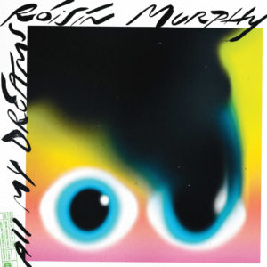
 2
2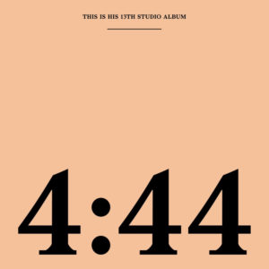 3
3 4
4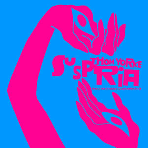 5
5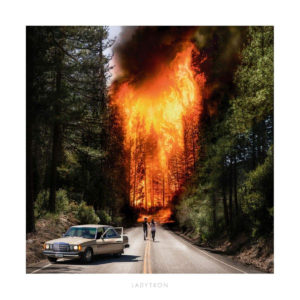 6
6 7
7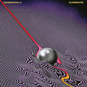 8
8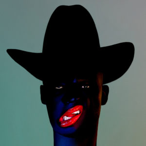 9
9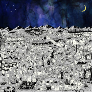 10
10 Modern magazine design started when Alexey Brodovitch was appointed art director of the American edition of Harper’s Bazaar in 1934. Today, many art directors working in advertising, editorial and book design remain inspired by the work of this Russian-born art director and are indebted to him.
 With his innovative use of typography, illustration and photography Brodovitch revolutionized and defined the look and feel of fashion magazines. He was the first to use a typeface with delicate serifs for the magazine’s masthead and many fashion magazines followed suit. Before the Dutch became renowned for their Total Football in the 1970s, Brodovitch had already introduced Total Layout, integrating image and text in his work. His layouts were ‘open’ as he left a lot of white space on the pages. The typography was experimental, refined and playful. He introduced typographic section start pages, big drop caps and initials at the beginning of a body text and the shape of the text sometimes echoed the pose of the model in a photograph.
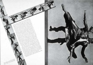 Brodovitch used photography to bring exciting dynamism and movement in his layouts. He achieved this by mixing small and large images on a spread, unconventional cropping, let images run over the page fold or position them in a 45 angle. Brodovitch worked with the best photographers, including Henri Cartier-Bresson, George Hoyningen-Huene, Man Ray and gave Richard Avedon his first assignment. He used to brief the photographers with just two words: “astonish me”.
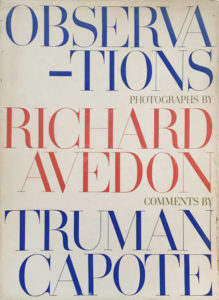 Brodovitch was frustrated that his design ideas were interrupted by advertising pages in the magazine. Perhaps his book designs are his best designs as there was no interference of advertising. He could completely focus on the rhythm of the pages. His design for Richard Avedon’s book ‘Observations’ is a landmark in photographic monographs. For a photography book, it is quite remarkable that the cover doesn’t feature an image by Avedon but only type set in blue, red, grey and the refined typeface Didot with its fragile serifs. He edited a book like a filmmaker is telling a story. Other projects by Brodovitch also feature only type on the cover such as ‘Ballet’ and ‘Portfolio’ (1949) – an art and design publication showcasing his phenomenal graphic skills.
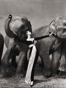 What we learned from Brodovitch?
 Sparks, 10cc and Roxy Music
 Talk Talk, Roger Waters, Nils Frahm and record producer Trevor Horn
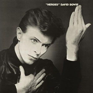 David Bowie
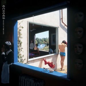 Genesis, Rush, Pink Floyd, King Crimson
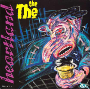 Bob Dylan, Matt Johnson (The The), Bruce Springsteen, Paul Simon
 Working with Music
 During brainstorms
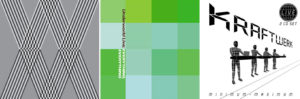 Designing magazine pages
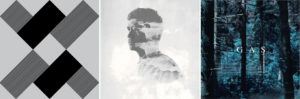 During writing
 Preparing an interview
 Memories
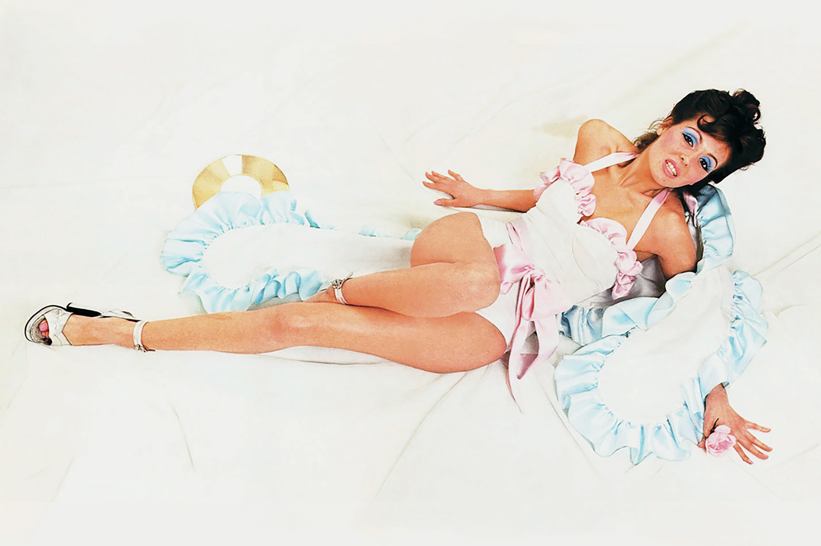 INSPIRED AMATEURISM
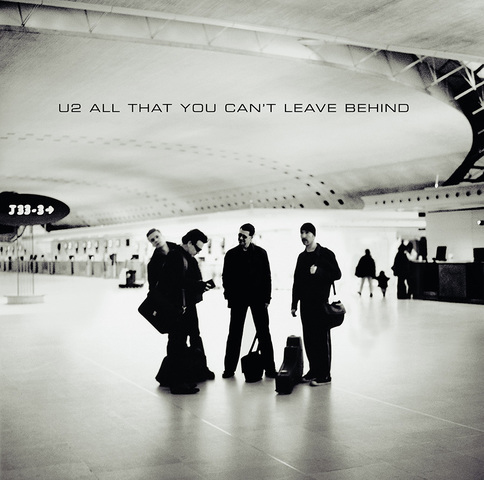 Back-to-basics
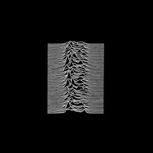 GREAT ART DIRECTORS MONOGRAPHS
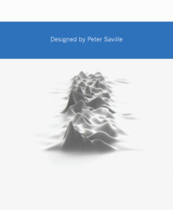 The sleeve has been designed by Peter Saville and is in the collection of the MoMA. Often his designs are a reflection of his own perception of the band he collaborates with or the brand that commissioned him. As the co-founder and art-director of Factory Records he applied this philosophy to the sleeve designs for many bands including Joy Division, New Order, Orchestral Manoeuvres in the Dark, Ultravox or fashion catalogues for Yohji Yamamoto. A literal translation of the song lyrics is considered too banal and so Saville always aims to create a context around the band.
 Early on his career Saville saw the Roxy Music covers as an exercise in communication through styling. “They’re not about literally what’s on them; it’s the subtext that they open up and the place where they put the music”, he tells Christopher Wilson in his book. With his stylish and sensual sleeve designs for Suede and Pulp he made graphic design sexy.
 What we learned from Saville’s designs is how he creates ‘space’ around the work. He lets the work ‘breathe’ and leaves room for the viewer to participate. Just like in art which is meant to stimulate the viewer’s imagination.